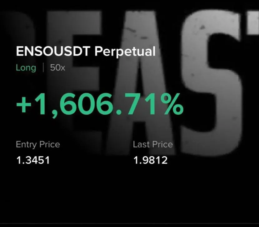
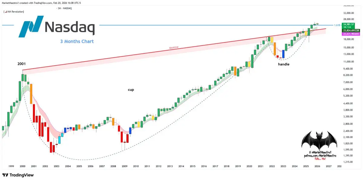
$NDX
I turned Nasdaq into a chart adjusted for real inflation.
Why? Nominal charts only show that the number on the screen is going up. While the
$SPX or Nasdaq may be making new highs in nominal terms, the currency may also be being devalued in the background. An inflation adjusted chart shows us real growth.
In short, I wanted a smoother and better view. The index is at the important fibo1.618 resistance zone, and for that reason it is struggling. Also, there is a very obvious cup+handle setup on the index, and it tells us the future will be bullish 💯
On the other hand, if the ... support z